
 Customer Experience
  Blog
Blog  Business Communication
  Leadership
  Marketing & Sales
  Productivity
  VoIP
VoIP 


Why do you need a call center dashboard? Well, if you can’t see what’s happening in your call or contact center, decisions like staffing forecasts and queue tuning turn into guesswork. And when you’re relying on guesswork, it’s harder to spot bottlenecks, coach effectively, or prove what’s working.
That’s where dashboards help. Both a call center dashboard and contact center dashboard give you a clear view of what’s happening now and how performance is trending over time, so you can adjust routing, staffing, and processes with real data, not assumptions.
This guide covers both the voice-first call center dashboard and omnichannel contact center dashboard, including what they typically include and how teams use them to report and improve performance.
What Does a Call Center or Contact Center Dashboard Consist Of?
Dashboards provide a comprehensive and scannable view of critical key performance indicators (KPIs), giving contact center managers valuable insights into contact center and call center performance. A call or contact center platform enables users to pull data from multiple sources, such as call logs, ticketing systems, and customer feedback, in order to provide a unified view of contact center operations.
A quick note on terminology:
A call center dashboard is usually voice-first, focused on queue health and core phone KPIs like service level, average speed of answer (ASA), abandon rate, and average handle time (AHT).
A contact center dashboard covers voice plus digital channels (chat, SMS, email, social), so it also tracks channel mix, digital response times, chatbot containment and handoffs, and omnichannel customer satisfaction.
A contact center dashboard (or call center dashboard) includes many configurable components. Depending on your platform, you can display metrics as line charts, bar graphs, tables, and heatmaps, and then choose views that match your goals and operating style.
Voice KPIs vs. digital KPIs (quick callout)
If you manage an omnichannel contact center, it helps to separate voice metrics from digital-channel metrics. They reflect different parts of the customer experience and often require different staffing and service targets:
- Voice KPIs (call center dashboard): Service level, ASA, abandon rate, AHT, occupancy/utilization
- Digital KPIs (contact center dashboard): First response time, time to resolution, backlog volume, handoffs/transfers between channels or teams, chatbot containment rate, CSAT by channel
Real-time vs. historical (quick explainer)
A strong call center or contact center dashboard separates real-time views from historical reporting because they serve different purposes.
Real-time dashboards help supervisors monitor and manage key metrics instantly (queue volume, wait times, service level, agent availability, and active conversations) so they can make quick staffing and routing decisions.
Historical dashboards show performance over time (daily, weekly, monthly) so you can spot trends, diagnose recurring issues, plan staffing, and improve coaching, workflows, and customer experience. Analyzing performance trends over time helps inform strategic decisions and continuous improvement.

Benefits of Using a Call or Contact Center Dashboard
A call or contact center dashboard turns day-to-day performance into clear, usable data. With real-time insights and historical reporting, managers can make informed decisions faster, improve operational efficiency, and deliver exceptional customer service.
Key benefits include:
- Faster decisions in real time: Track queue health, service levels, and active conversations so you can adjust staffing and routing quickly.
- Better agent performance: Monitor key metrics for agents, spot coaching opportunities, and support QA efforts with performance trends over time.
- Clearer customer experience signals: Pair operational metrics with customer feedback (like CSAT) to see what’s working and what needs attention.
- Smarter resource allocation: Use trends and patterns to forecast demand, plan schedules, and reduce avoidable costs.
- Continuous improvement: Identify recurring issues, measure changes, and keep improvements tied to measurable outcomes instead of guesswork.

Accessibility and mobility
Most modern dashboards are cloud-based, which means teams can view performance from anywhere with an internet connection. Mobile-friendly dashboards help managers stay on top of real-time metrics and keep contact center operations running smoothly across locations or distributed teams.
4 Key Dashboard Areas and Their Specific Metrics
A strong contact center dashboard connects the key metrics you track to the decisions you need to improve call center performance. These four dashboard areas cover the core reports most teams rely on to monitor volume, evaluate agents, measure customer outcomes, and keep daily operations running smoothly.
1. Call volume and trends
The most basic report you need on your real-time dashboard is the number of calls. Call volume is a critical metric for understanding staffing needs and overall call center and contact center performance.
As well as calls received over a period of time, you can filter the following:
- Total calls
- Missed calls
- Answered calls
- Abandoned calls (when a caller hangs up before an agent has answered)
- Channel mix (voice, email, chat, SMS, social media, etc.)
When you receive many calls per day, you have a large pool of data. Within this data, your call analytics software starts to spot call volume trends:
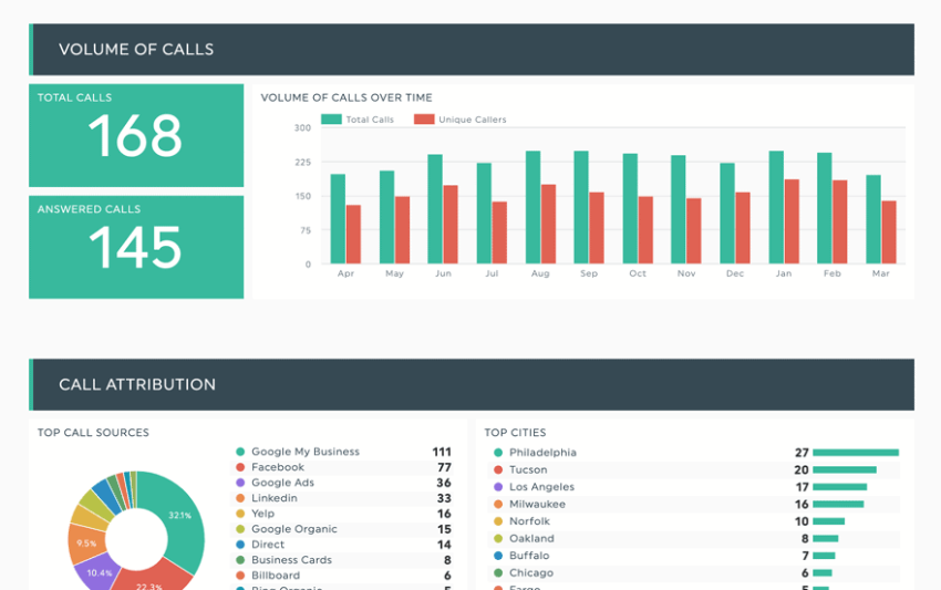
A contact center dashboard can report on:
- Hourly trends
- Daily trends
- Weekly trends
- Monthly trends
- Annual trends
- Peak times
- Seasonal fluctuations
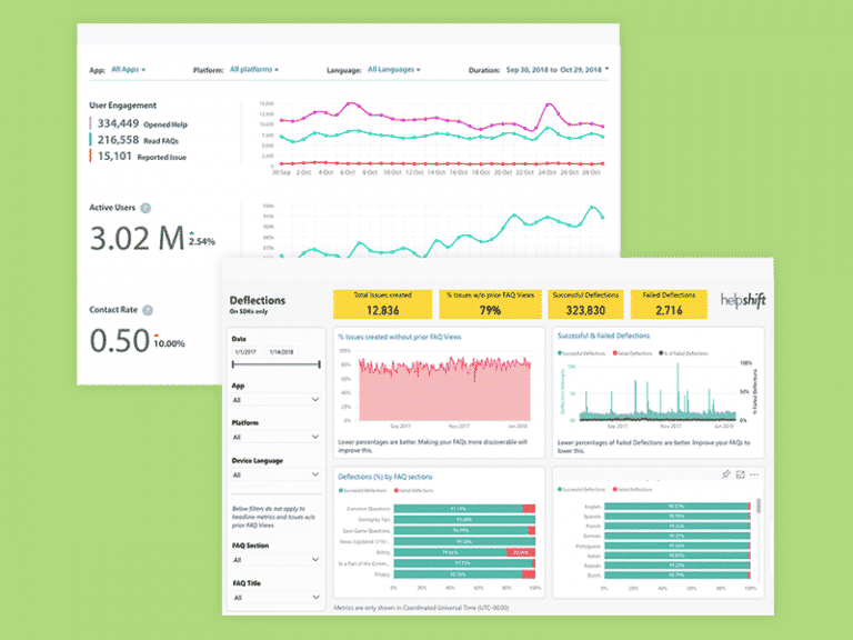
Monthly KPI dashboards allow companies to scan through historical data to find patterns and opportunities aligned to contact center performance.
When there’s pressure to answer every call within a target time frame, it’s important to set a reachable benchmark.
Running a service level agreement (SLA) compliance dashboard allows you to view the percentage of calls answered within your target time frame, which is a key standard for performance.
For example, you answer 80% of calls within 20 seconds, which seems okay. But you also might notice that your average speed to answer is 28 seconds, so you know there must be some anomalies:
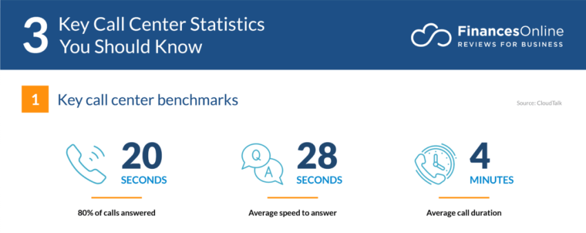
Historical data on metrics like call volume and average handling time helps identify trends, which means you can start to investigate why some calls take so long to get answered.
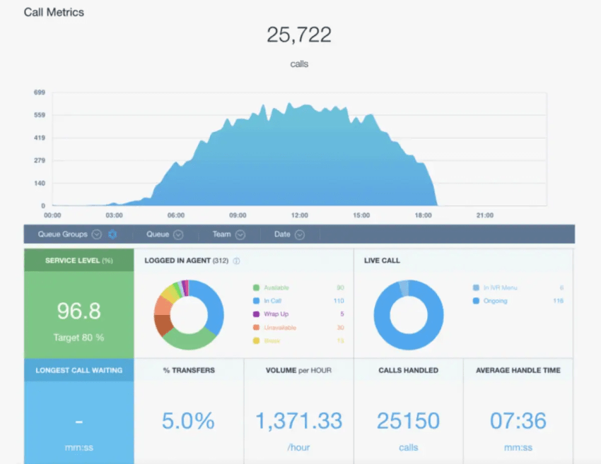
2. Agent performance
In addition to displaying call volumes and trends on your contact center dashboard, you can show specific agent metrics.
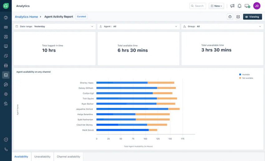
Agent availability shows the number of agents logged in, on calls, and idle. Displaying these metrics on real-time wallboards allows supervisors to make decisions about when to free up agents who aren’t needed to take calls right then. The opposite is also true during times of high call volumes without the right number of agents available to handle what’s coming in.
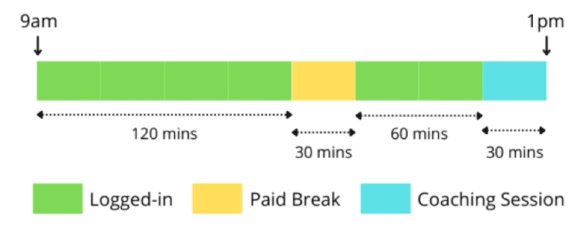
This enables targeted coaching, training, and contact center workflow adjustments to enhance efficiency and customer interactions. And at the end of the day/week/month, you can get an overview of each agent’s time available versus unavailable:
Average handle time (AHT) displays the average time spent on each call. You can use this metric to form a benchmark for junior agents to strive for on completion of their training.
First contact resolution (FCR)reports on the percentage of calls resolved on the first interaction. This is a vital metric to work out whether agents are resolving all your customers’ queries or simply trying to end the call quickly.
This can happen in some call centers when agents are concerned with hitting time-based metrics rather than quality.
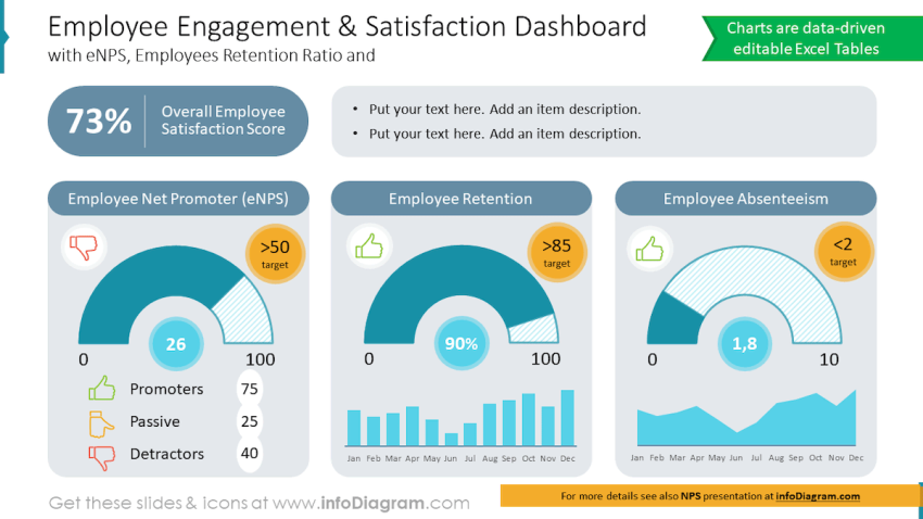
Agent satisfaction is a less-used but highly important key performance indicator (KPI) that puts your employees’ experience first. After all, job satisfaction means high retention and happy customers.
Scores are collated from internal surveys and availability states to provide a snapshot on how happy your agents are at work:
3. Customer satisfaction
Customer satisfaction is, quite simply, how happy your customers are with the service you provide. You can use several metrics, with relevant data gathered from your customers, to display on your call center dashboard.
A customer satisfaction score (CSAT) is the average rating from customer surveys or feedback forms. Here, you’re directly asking customers questions about their experience with your company over the last quarter/year.
| Note: This metric is different from how happy they are with your product. The questions you include in your survey should be asked accordingly. |
Net promoter score (NPS) is the likelihood of customers recommending your service to others, gathered by asking the literal question: “Based on your last interaction, how likely are you to recommend our service?”
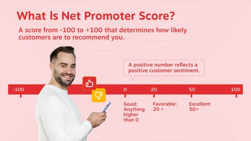
CSAT and NPS are great metrics to compile over time and include on a KPI dashboard. For a live data view of how your customers are feeling, sentiment analysis provides the overall emotion of customer interactions (positive, negative, or neutral).
You can get a score out of five points for tone, greeting, and call rating. When calls drop below a certain benchmark or specific words are used, calls are automatically flagged to a supervisor.
Where does your CX strategy stand with AI?
Take the AI Maturity assessment to get personalized recommendations on how to enhance your CX.
4. Operational efficiency
Your call volume and agent performance metrics can all be broken down to provide actionable insights.
Call center metrics such as call abandonment rate show the percentage of calls abandoned before being answered:
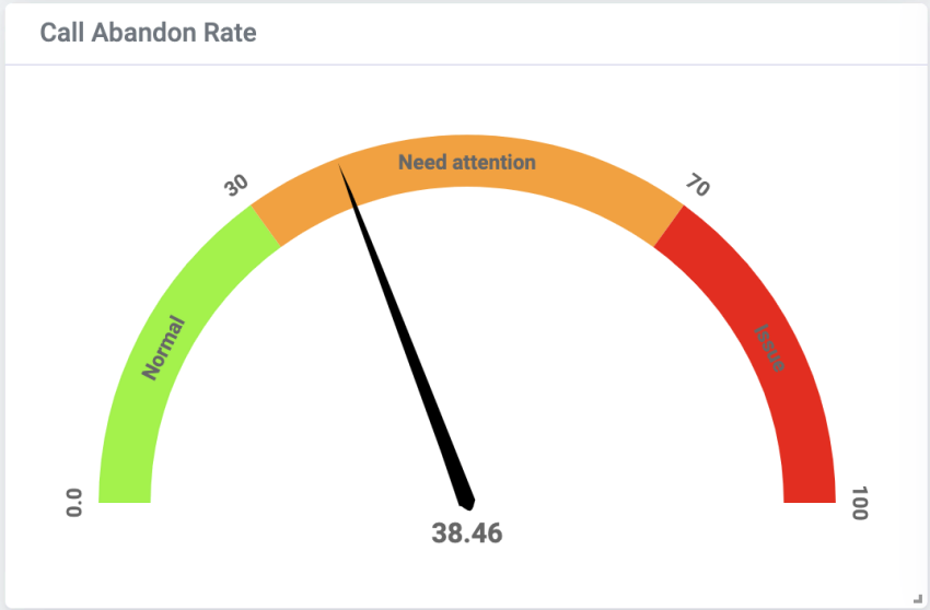
If you have a high abandonment rate, it means you have lots of customers giving up before you answer their calls. This can lead to unhappy customers in the moment and churn in the long run.
Tracking this metric in real time helps you keep a handle on whether you have enough agents answering inbound calls.
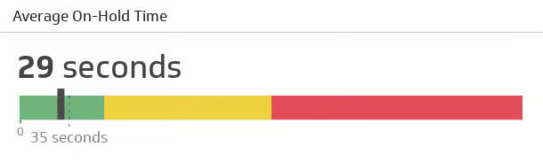
Average hold time is another KPI that impacts customer happiness and helps you judge whether you have enough quantity or quality of agents answering calls.
This metric shows the average time customers spend waiting on hold (it can also compare against your best and worst days):
Resolution rate indicates the percentage of calls resolved within a specific time frame:
Let’s say your target response time is 10 minutes, but agents tend to spend 13 minutes start to finish on calls. Your resolution rate is over by 30%, denoting either a dip in call center productivity or an inflated target time.
Resource utilization includes tracking the efficiency of agent assignments, comparing how long each agent spends logged in or on a call versus time spent on breaks, wrap-up, or training:
You can track all these key metrics in real time and historically on your analytics dashboard.
You can also display them on a live wallboard in your office and/or in meetings with supervisors and other stakeholders in your business.
Call Center Dashboard Examples
1. Live wallboard
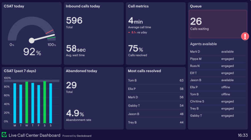
The purpose of a live wallboard is to present real-time insights, allowing agents to monitor and select the most relevant metrics for their roles:
Agents can see how they (or their team) are performing compared to other agents and past call center performances. Using wallboards in this manner inspires gamification and continuous improvement.
A live wallboard gives supervisors a holistic view of day-to-day operational efficiency, alerting them to any abnormal call patterns or customer behaviors.
Common key metrics on a live wallboard include:
- Total number of calls today
- Average wait time
- Percent of calls resolved
- Abandonment rate today
- Best-performing agents
- Current agent states
For more wallboard layout ideas (BI examples):
- Tableau Accelerator: Call Center (KPI tiles, service levels, answered vs. abandoned, agent views).
- Tableau Public example: Call Center Dashboard (Weekly Summary) for wallboard-style KPI grouping and trend panels.
2. Historical call center KPIs and metrics
A performance dashboard with historical reports helps supervisors and managers identify long-term patterns, monitor KPIs over time, and make business decisions like agent recruitment and call queue configuration.
You can also dig into factors such as drops in CSAT and call resolution to work out whether agents need more training.
Common historical metrics include:
- First-call resolution rate
- Comparison of daily calls per month
- Trends in CSAT
- Spikes and drops in call resolution
- Average handle time
- Average time on hold
For historical reporting layouts (BI examples):
- Power BI example: Call Center KPI Dashboard for trend + KPI reporting layouts.
- Power BI example: Call-Center Interactions Dashboard (built with standard Power BI visuals) for a clean historical KPI layout.
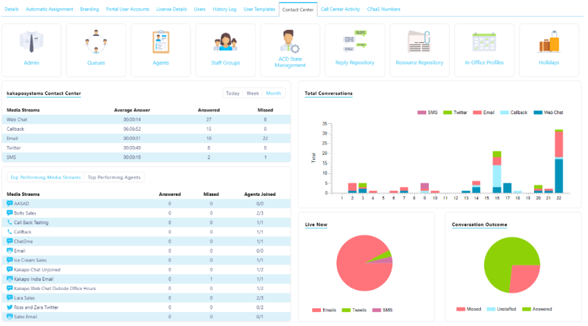
3. Channel mix
A good contact center software solution should support omnichannel communications, including voice calls, chat, email, SMS, and social channels. If you run a contact center (voice plus digital channels), channel mix reporting shows where customers actually reach you, and where staffing and tooling should follow.
For example, if you’ve added email and SMS but those channels account for only a small share of customer interactions, you may not need to expand coverage there yet. On the other hand, if chat and email volume are climbing, you’ll want enough trained agents available to keep response times low and maintain service levels across every channel.
Channel mix dashboards are also useful for tracking handoffs between channels and teams, such as chatbot-to-agent transfers, chat-to-phone escalations, or email threads that turn into live calls. If handoffs are frequent, it can signal that self-service flows need refining or that agents need better context when conversations switch channels.
In real time, channel mix can even support staffing decisions: if call volume spikes, you can temporarily shift coverage from slower channels to keep the queue moving without letting digital conversations stall.
For channel mix and drill-down inspiration (data viz galleries):
- ZoomCharts’ Power BI dashboard examples gallery for interactive filtering and drill-down patterns you can adapt to channel mix views.
- Qlik’s dashboard examples guide for layout patterns and KPI dashboard approaches (helpful for organizing multi-metric views).
Best Practices When Building Your Call Center Dashboard
Best practices apply to both call centers and omnichannel contact centers, but contact center dashboards usually need clearer separation between real-time views and historical reporting across voice and digital channels.
Follow these best practices to optimize performance and enable proactive management, thereby making the most of your investment.
Customization
Most platforms (call center software) come with prebuilt dashboard templates, but tailoring what you see to your operation is what makes the data useful, especially if you run a contact center with both voice and digital channels.
- Use role-based dashboards with different layouts and KPIs for agents, supervisors, and managers, so each group sees what they need to act on.
- Choose the KPIs that matter most by selecting from standard metrics or creating custom ones that reflect your goals and workflows.
- Customize by channel when needed (voice vs chat vs email/SMS) so teams can track performance without mixing different service-level expectations.
- Apply branding and visual cues (themes, labels, and simple color rules) to highlight departments, queues, or regions at a glance.
- Connect to business systems (CRM, ticketing, scheduling) to link contact center activity to outcomes like ticket resolution, customer retention, and sales conversion.
Real-time updates
Real-time metrics enable supervisors to allocate resources effectively during peak periods. When something goes wrong, you need to know about it right away. Failure to act fast can sometimes mean losing a customer.
Configure the following to stay ahead of the curve:
- Streaming updates: Continuously refresh data for immediate monitoring of call volume, agent status, and customer sentiment.
- Dashboard refresh intervals: Set custom refresh rates to balance data accuracy with efficiency.
- Live agent activity: Track individual agent call handling in real time for coaching and support.
Filtering and drill-down
With call center features like auto attendant, interactive voice response (IVR), and CRM integration available as standard, having a reporting tool or view is vital to ensure they’re set up as efficiently as possible.
For example, if everyone presses option 8 on your auto attendant, it’s a clear sign to move it to the front of the queue.
Use the following filters to get a view of the components you use the most:
- Advanced filters: Filter data by specific criteria like feature, agent, call type, resolution code, and time period.
- Multilevel drill-down: Dive deep into key metrics to uncover underlying causes and trends.
- Interactive features: Use clickable charts and tables to drill down into specific metrics for a more detailed analysis.
Alerts and notifications
If your call center dips below certain thresholds for key metrics, getting an audible beep, an email, or a notification in your supervisor interface means you’re best positioned to respond to what’s happening.
Use the following interactive dashboard features to always be in the loop:
- Configurable alerts: Set thresholds for critical metrics like SLA breaches, high call volume, or low CSAT scores.
- Multiple notification channels: Receive alerts via email, SMS, or in-app pop-ups.
- Customizable escalation rules: Define escalation paths for different alert types and severities.

Common Mistakes to Avoid
Dashboards are only useful if they drive clear decisions. These common mistakes can make reporting harder to trust and day-to-day management less effective:
- Tracking too many KPIs on one screen: Overloaded dashboards hide what matters. Limit each view to the metrics the user can act on in that moment.
- No consistent KPI definitions: If “answered,” “abandoned,” or “service level” mean different things across reports, teams won’t trust the numbers. Standardize definitions and document them.
- Only looking at averages (missing peaks): Averages can mask busy periods. Review hourly trends, percentile views, and peak-time agent performance so you don’t miss short spikes that drive poor experiences.
- Not separating real-time vs reporting views: Real-time dashboards are for staffing and queue decisions; reporting dashboards are for trends and improvements. Mixing them makes both less useful.
- Optimizing for speed and hurting quality: Chasing low handle time can increase repeat contacts and reduce CSAT. Balance efficiency metrics with quality measures like first-contact resolution and QA scores.

Trends and Future Directions
Both call center dashboard and contact center dashboard tools are evolving quickly as customer expectations rise and channels multiply. Here are the trends shaping what dashboards will look like next:
- AI-driven insights and forecasting: More platforms use AI/ML to surface patterns automatically—such as likely spikes in volume, emerging issue trends, and staffing forecasts based on historical demand.
- Cloud-first scalability: Cloud dashboards make it easier to add teams, locations, and channels without rebuilding reporting, while keeping real-time views available anywhere.
- Omnichannel reporting by default: Contact center dashboards increasingly combine voice, chat, email, SMS, and social into one view, including channel mix, handoffs, and response-time performance across channels.
- More interactive, personalized views: Role-based dashboards (agent, supervisor, operations) with drill-down filtering are becoming standard so each user sees the metrics they can act on.
- Deeper automation and alerts: Real-time notifications are getting smarter—flagging anomalies (queue spikes, rising abandons, chat backlogs) and prompting action before service levels slip.
Dashboarding Made Simple for Call and Contact Centers with Nextiva
A comprehensive solution supports your contact center team by providing real-time insights and tools that help maintain overall operational efficiency. The difference between using and ignoring call center or contact center dashboards is clear:
- Those who use them can refine their processes, have happy customers, and employ productive agents.
- Those who don’t may panic when the smallest change happens, be unable to respond to dynamic customer demand, and experience high churn rates.
Having access to metrics that make a difference, in an easily digestible view, ensures supervisor productivity and customer satisfaction.
Phat Scooters, for example, needed visibility into how their calls were performing. They needed a system to record calls and help the customer support team maintain conversation quality as the business grew. After choosing Nextiva to support their customer experience, Phat Scooters is now maintaining quality via advanced call recording and analytics. The ability to replay past calls helps them uphold their legendary customer service.

If you’re ready to start using the right metrics to drive more customer value, see what Nextiva’s contact center platform can do for you. With a variety of preconfigured dashboards and a team of experienced call center consultants, we can create the right dashboards that match your business.
The right cloud call center can go a long way.
And that’s Nextiva. With every feature you need to power your call center, you’ll give your agents reliable, virtual access and your customers unmatched service.