
 Customer Experience
  Blog
Blog  Business Communication
  Leadership
  Marketing & Sales
  Productivity
  VoIP
VoIP 


Businesses that adopt customer-centric strategies can double their revenue growth (McKinsey). Businesses committed to creating positive customer experiences naturally outperform their competitors in terms of loyalty, satisfaction, and revenue. And a customer experience dashboard is one of the most effective ways to achieve these results.
A CX dashboard visually tracks customer interactions in real time throughout the customer journey. It uncovers gaps, highlights trends, and supports quick, data-backed decisions. From agent performance to touchpoint optimization, it keeps teams aligned and responsive.
In this guide, we’ll dissect everything about a customer experience dashboard: what it is, what benefits it offers, how to create it, and provide some examples of informative, scalable, and effective CX dashboards.
What Is a Customer Experience (CX) Dashboard?
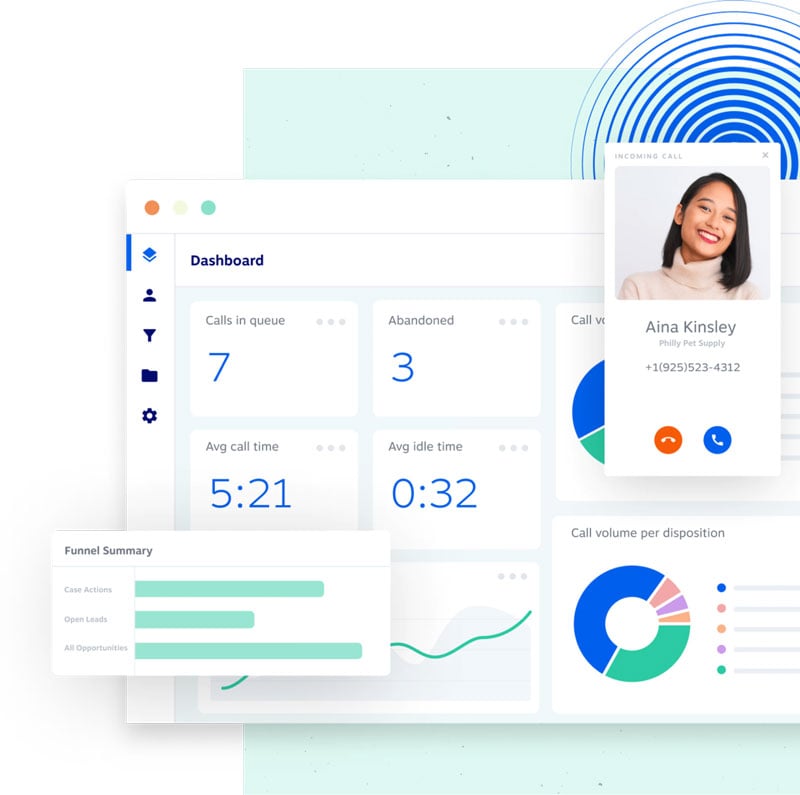
A customer experience (CX) dashboard is a visual representation of customer interactions, which shows real-time and historical data from multiple sources, including support requests, survey responses, call center performance, and chat logs, and turns raw information into clear, actionable insights.
These visual summaries simplify complex data. Teams can quickly identify what’s working and what’s not to make adjustments in real time. Decision makers, frontline teams, and stakeholders get a shared view of the customer experience through CX dashboards. This shared focus supports long-term customer engagement and key business improvements.
Where Do You Get Data for a CX Dashboard?
Data in a customer experience dashboard mainly comes from the following touchpoints:
- Customer surveys: Direct feedback from surveys on net promoter score (NPS), customer satisfaction score (CSAT), and customer effort score (CES).
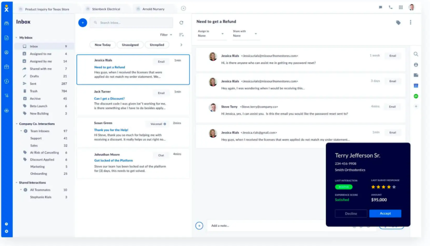
- Support interactions: Data from call center performance logs, live chat transcripts, email support tickets, and chatbot conversations.
- Website and app analytics: Behavioral data that shows how customers use your digital offerings, where they encounter issues, and what their conversion paths look like.
- Social media sentiment: Analysis of brand mentions, public comments, and direct messages on social media platforms to understand customer perceptions.
- Product or service reviews: Qualitative and quantitative feedback from public review portals and on-site customer testimonials.
- CRM and transaction data: Information on purchase history, account status, loyalty program activity, and lifetime value.
Benefits of a CX Dashboard
Let’s see how CX dashboards are commonly used and the value they offer.
Measure your customer experience
CX dashboards help track key customer experience metrics like customer satisfaction, net promoter score, average handle time (AHT), and first contact resolution (FCR) rates. You don’t just monitor numbers but shift reactive support to proactive problem resolution. If metrics drop unexpectedly, you can immediately investigate and resolve the cause before other customers are affected, protecting your revenue and brand reputation.
Analyze feedback trends and reduce costs
Customer experience dashboards are essential for analyzing historical data and identifying communication patterns. You’re better able to spot operational inefficiencies, common issues that can be resolved with a help article (reducing agent load), or peak periods that require better staffing. Identifying trends in customer feedback allows you to adapt to market demands faster and have a strategic edge over competitors.
Visualize the customer journey
Customer experience dashboards map interactions at every touchpoint — from website visits to support calls. Visualizing the customer journey helps you identify and eliminate frustrating friction points. A smoother, personalized experience builds customer loyalty, which in turn increases customer lifetime value (CLV) and creates committed brand advocates.
Get data-backed customer insights
A CX dashboard isn’t just a reporting tool. It’s a single source of truth for different departments. When your product, marketing, sales, and support teams all access the same customer data, internal silos are broken down. This shared understanding introduces teams to a powerful, data-driven culture where every employee can make decisions that improve the customer experience.
Key Metrics for a High-Impact CX Dashboard
A clean CX dashboard captures the right key performance indicators (KPIs). The most effective dashboards don’t just capture one area, but combine metrics from three essential categories: customer perception, operational performance, and business results.
Focusing on these categories gives you a strong overview, from customer perception to your teams’ performance and their impact on business results.
Customer perception and loyalty metrics
These metrics measure how your customers perceive your brand and their interactions. They provide direct feedback on customer experiences.
- Net promoter score (NPS): Measures long-term customer loyalty by determining the likelihood of a recommendation on a scale of 0 to 10. It tracks brand health and future growth based on customer sentiment.
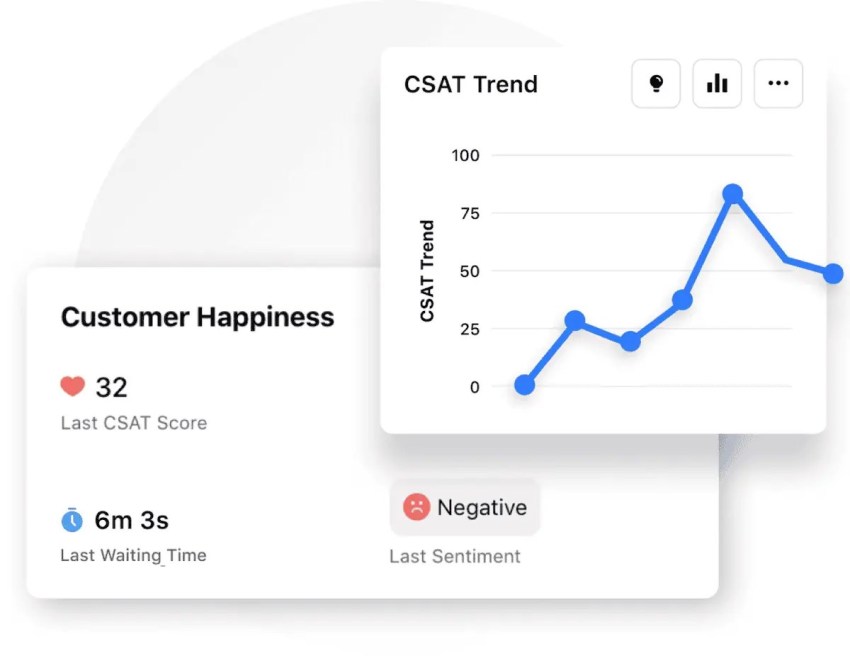
- Customer satisfaction (CSAT): Measures immediate, short-term satisfaction with a specific interaction (e.g., a support call or a purchase), typically on a scale of 1 to 5. It allows you to identify and improve satisfaction at specific touchpoints in the customer journey.
- Customer effort score (CES): Measures the effort a customer had to put in to resolve a problem or answer a question. A high effort value indicates friction. Reducing customer effort increases customer loyalty.
Operational and service metrics
These metrics capture the efficiency of your internal teams to understand how your operational performance impacts the customer experience.
- First contact resolution: Measures the percentage of customer issues successfully resolved on the first interaction without requiring follow-up. A high FCR signals a competent team and efficient processes.
- Average handle time: Measures the average time an agent takes for a single customer interaction, including all conversations and follow-up. AHT helps you with staffing and resource planning. It should be monitored alongside customer satisfaction (CSAT) to keep the service quality intact and not sacrificed for speed.
- First response time (FRT): The average time it takes a customer to receive an initial response from your support team. Fast responses are key to enhancing customer experience and show that you value your customers’ time.

Business and financial outcome metrics
These metrics connect your customer experience efforts directly to the financial health of your company, proving the return on investment (ROI) of your strategy.
- Customer churn rate: Measures the percentage of customers who discontinue business with you within a given period. Rising churn requires immediate attention.
- Customer retention rate: Measures the percentage of customers you have successfully retained over a given period. High customer retention signals a successful CX program, as it’s almost always more profitable to retain an existing customer than to acquire a new one.
- Customer lifetime value: Measures the total revenue you can expect from a single customer over the entire business relationship. CLV helps you identify your most valuable customers and intelligently invest your marketing and support budget.
How to Build a Customer Experience Dashboard
When you’re ready to take customer experience management to the next level, following these five steps will help you create a dashboard that delivers value to your team.
1. Define clear objectives and choose aligned KPIs
First, define what you want to achieve. Do you want to improve service efficiency, increase customer loyalty, or reduce customer churn? Your goals will determine which key performance indicators are most important. Avoid superficial metrics and choose customer engagement KPIs that provide strong customer insights.
2. Integrate your data sources
For a complete view, unify data from different systems like your VoIP provider, call center software, CRM, and feedback platforms. Choose a platform with data synchronization capabilities through pre-built integrations or flexible APIs.
For example, a unified communications platform like Nextiva can integrate with other core tools like Salesforce or Zendesk to create a cohesive data ecosystem of customer history.
3. Design for clarity and usability
A clean, well-organized interface makes data easier to understand and act on. Skip the clutter and focus on logical structure and intuitive visuals.
- Use color-coding: Green for positive trends, red for critical issues, yellow for warnings.
- Choose the right visualizations: Use line charts for trends, bar graphs for comparisons, and heat maps for patterns.
- Create role-based views: Tailor dashboards for executives (high-level outcomes) and team leads (operational data).
- Prioritize a clear visual hierarchy: Place the most important metrics in the top-left corner.
- Enable drill-down capabilities: Allow users to click from a high-level metric to the detailed data behind it.
4. Implement real-time monitoring
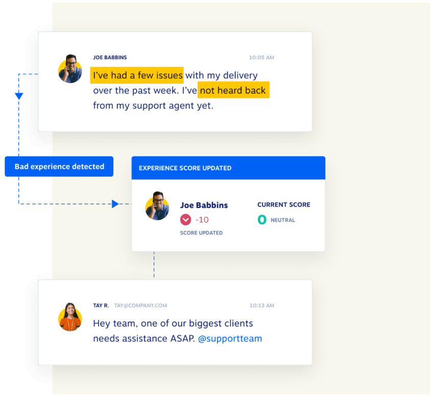
Your CX dashboard should display real-time data to help you quickly identify and resolve issues. If customer satisfaction suddenly drops, you should be able to respond immediately and identify the root cause, whether it’s a new hire needing more training or a product defect leading to a flood of complaints. The more accurately you can monitor customer satisfaction, the better.
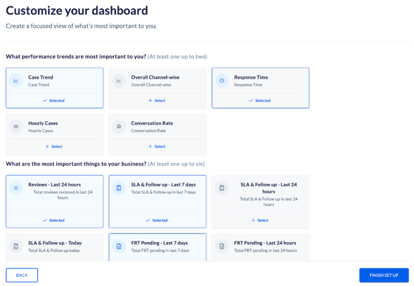
5. Customize your dashboard to scale
Choose a customer experience platform that lets you customize views, apply filters, and create custom reports. As your business grows, your dashboard needs to keep pace. Your chosen solution should also integrate new tools and align KPIs with your priorities and be effective as your strategy and technology stack evolve.
Best Practices for Effective Dashboard Reporting
To get the most out of your CX dashboard after you’ve built it, keep these five best practices in mind:
- Tailor reports to your audience: Don’t show everyone the same dashboard. Executives need the “what” (business results), while managers need the “why” (operational details). Customize reports so the data is relevant to the viewer’s role.
- Use clear and concise visuals: Use simple charts, clear labels, and plenty of white space. If a metric doesn’t contribute to one of your core objectives, remove it. Cluttered dashboards confuse users, so provide clear insights.
- Focus on actionable insights: Data only becomes valuable when you explain what it tells you and what to do next. Add a small text box with annotations, such as: “NPS dropped 5 points after we rolled out the new interface; examine user feedback from this group.” This turns data into an instruction.
- Ensure accuracy and reliability: Regularly review your data sources and keep consistent metric definitions across the organization so everyone makes decisions based on reliable information.
- Provide context and analysis: Raw data requires explanation. An increase in call volume could be due to a campaign rather than a system issue. Consider internal factors (e.g., staffing changes) and external factors (e.g., seasonality) to help viewers better understand the data.
Customer Experience Dashboard Examples
A single dashboard is rarely enough for everyone. Successful businesses create different views tailored to specific roles. Here are some examples of CX dashboards:
1. The Executive Leadership Dashboard
This dashboard focuses on the big picture and the financial impact. It answers a key question: “How does our customer experience drive business growth?”
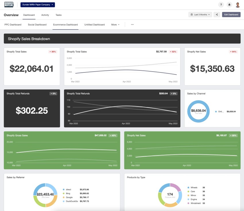
- Key metrics: Customer lifetime value, customer churn rate (as a percentage and monetary value), NPS over time, and customer acquisition cost (CAC).
- Visual representation: Line charts showing trends over the past 12 months, large scorecards for the current quarter’s KPIs, and a bar chart comparing churn rates to the previous year.
2. The Support Manager Dashboard
This dashboard is operational and focuses on team efficiency and service quality. It answers, “How well is my team serving our customers now and in the last week?”
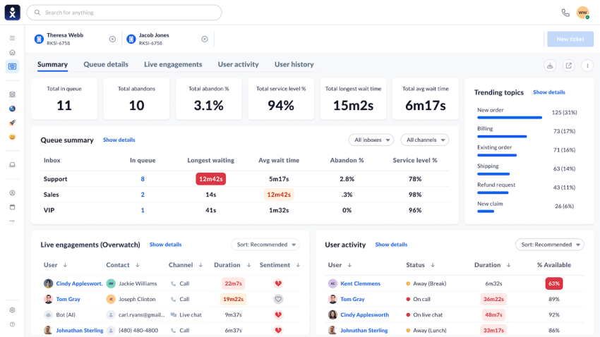
- Key metrics: First contact resolution, average handle time, real-time call/chat volume compared to available agents, customer satisfaction scores by agent, and a leaderboard of top performers.
- Visual representation: Bar charts comparing agent performance, real-time service level metrics, and a table view of recent low customer satisfaction scores with drill-down links to the ticket.
- Purpose: Manage daily operations, identify agent coaching opportunities, adjust staffing levels based on volume, and quickly resolve service quality issues.
3. The Product Team Dashboard
This dashboard directly links customer feedback to product usage and development. It answers, “How do customers experience our product and where is there room for improvement?”
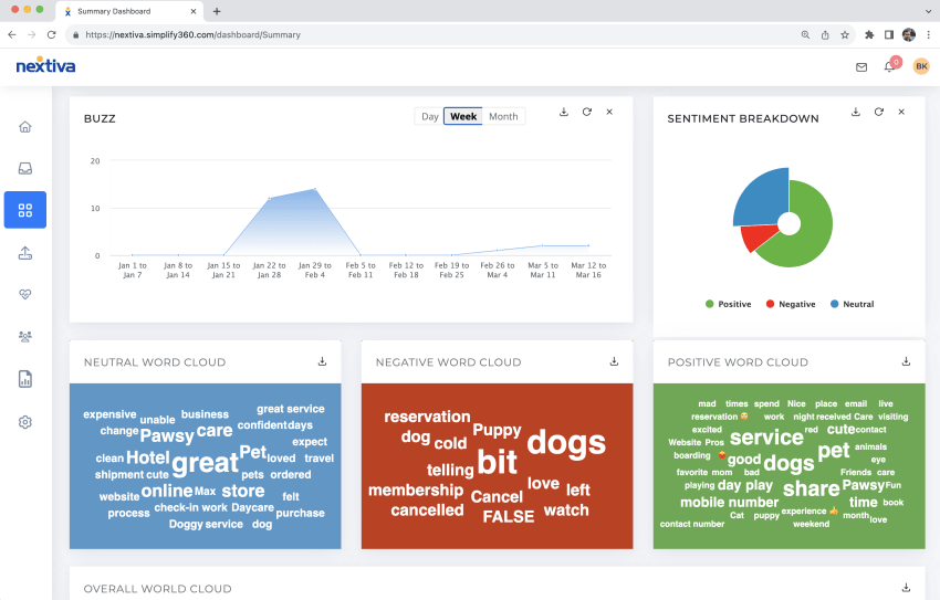
- Key metrics: Customer effort score for specific features, feature adoption rates, bug reports by category, and qualitative feedback from NPS/CSAT surveys (often visualized as a word cloud).
- Visual representation: Funnel analysis showing user drop-off in key workflows, line charts of post-launch feature usage, and a prominent feed with categorized customer comments.
- Purpose: Prioritize the product roadmap, identify and resolve usability issues, and align development efforts with customer needs.
How Nextiva Helps Craft the Perfect CX Dashboard
For a meaningful customer experience dashboard, you need the right customer experience technology and data. Your insights are only as good as the data you capture, where the right customer experience tools play a big role.
Complete solutions like Nextiva offer integrated analytics that combine data from calls, chats, and emails into a unified, reliable view of the customer journey.
While businesses can combine specialized tools, using a unified customer experience management (UCXM) platform like Nextiva with robust, pre-built integrations simplifies the process. With Nextiva, you can capture accurate and full customer data to make informed decisions and build stronger, more profitable customer relationships.
A complete customer experience solution.
See why top brands use Nextiva to handle calls at scale. Easy to use. Fast setup.