Tabular templates display statistics in a table, which can be presented for both Call Center queues and individual Agents.
- Under Display Template, click the Plus (+) icon to the right of the Tabular Template panel.
- Enter a Name for the new tabular template.
- Select the desired ACD Queue Statistics by clicking the statistic(s) displayed under Available Statistics. Click the right arrow to add the statistic(s) to Included Statistics.
- Under ACD Queue Statistics, click the Show drop-down and select one of the following options to display in a specific order based on the included statistic.
- The top: Display the top-performing queues.
- The bottom: Display the bottom performing queues.
- All queues: Display all queues.
- No queues: Display only Agent/User statistics.
- Specify the total number of queues displayed based on the desired statistic, if “the top” or “the bottom” is selected.
NOTE: Users can customize the order of the Included Statistics by using the up and down arrows.
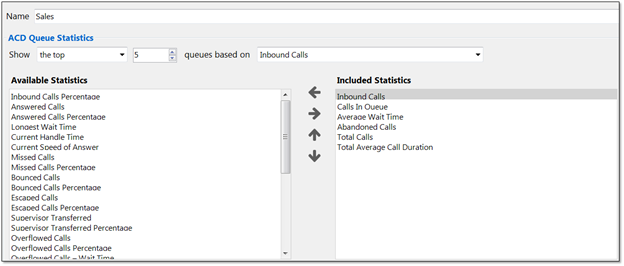
ACD Queue Statistics
- Select the desired Agent/User Statistics by clicking the statistic(s) displayed under Available Statistics. Click the right arrow to add the statistic(s) to Included Statistics.
- Under Agent/User Statistics, click the Show drop-down and select one of the following options to display in a specific order based on the included statistic.
- The top: Display the top–performing Agents/Users.
- The bottom: Display the bottom performing Agents/Users.
- All agents: Display all Agents.
- No agents: Display only Cell Center queue statistics.
- Specify the total number of Agents/Users displayed based on the desired statistic if “the top” or “the bottom” is selected.
NOTE: Users can customize the order of the Included Statistics by using the up and down arrows.
Agent/User Statistics
Configuring Thresholds:
There are two types of values: non-negative integers and time spans. Users can specify different colors to represent different values on the tabular view. For example, a Supervisor may want Calls In Queue to display green when 1-5 calls are in queue, yellow when 6-10 calls are in queue, orange when 10-15 calls are in queue, and red when more than 16 calls are in queue.
- To set up Threshold values, click the desired statistic under Included Statistics.
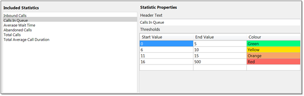
Configuring Thresholds
NOTE: If the selected statistic displays time duration, then the value entered should be in time span format (HH:MM:SS). For example, a Supervisor wants Total Average Call Duration to display green if under 5 minutes, orange if longer than 5 minutes but less than 10 minutes, and red if longer than 10 minutes.
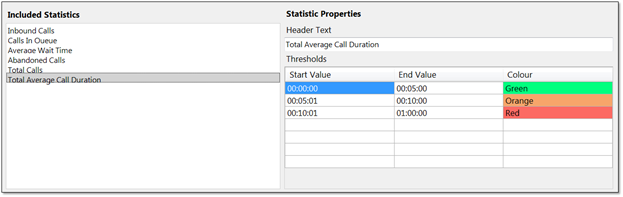
Time Span Thresholds
NOTE: Users can delete thresholds by right-clicking the desired row and clicking Delete Row.
- Click OK to save the new tabular template.

For additional assistance, please contact a member of our Amazing Service team by emailing support@nextiva.com to immediately open a case.
Related Articles:
- Installing Nextiva Unity
- Manually Upgrading Nextiva Unity Desktop
- Nextiva Unity Agent Interface
- Nextiva Unity Reception Interface
- Nextiva Unity Supervisor Interface
- Managing Calls from Nextiva Unity
- Managing Call Recording from Nextiva Unity
- Transferring a Call from Nextiva Unity
- Escalating a Call to a Supervisor
- Sending Instant Messages from Nextiva Unity
- Silent Monitoring from Nextiva Unity Supervisor
- Customizing Statistics in Nextiva Unity Supervisor
- Configuring Thresholds from Nextiva Unity Supervisor
- Creating Graphical Templates in Nextiva Unity Graphical Dashboard