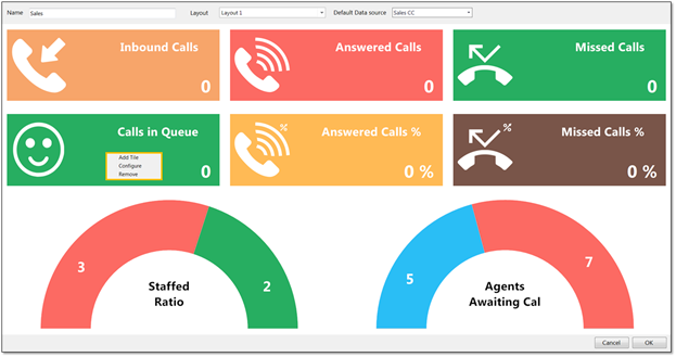
Graphical templates display statistics in a variety of graphical elements, including charts, tiles, and half and full gauges. Graphical templates can be presented for Call Center queues only.
- Under Display Template, click the Plus (+) icon to the right of the Graphical Template panel.
- Enter a Name for the new graphical template.
- Unity Dashboard provides a list of pre-set layouts featuring different components that can then be configured and edited. Select the desired layout from the Layout drop-down.
- Select the desired Call Center from the Default Data source drop-down list.
- All pre-set layouts are entirely configurable. Add and remove graphical elements from the pre-set layouts by right-clicking on an element and selecting the desired option (Add Tile or Remove).
 Add/Remove Options
NOTE: Users can change the graphical elements by removing the elements in that section and then right-clicking in the space and selecting from the list, as shown below.
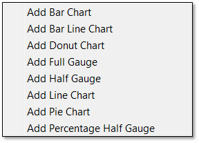
Adding Graphical Element Options
- To configure or edit a graphical element, right-click on the element, and select Configure.
- Enter the Name of the graphical element as it should be displayed. If left blank, the default statistic name will be displayed.
- Select the desired statistic from the Statistic drop-down menu.
- Check the desired Data Source(s), if not the default data source.
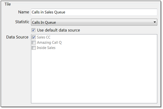
Configuration Window
Configuring Thresholds:
Color thresholds can be set for all graphical components with an additional icon threshold available for tiles. There are two types of values; non-negative integers and time spans. For example, a Supervisor may want Calls In Queue to display green when 1-5 calls are in queue, yellow when 6-10 calls are in queue, orange when 10-15 calls are in queue, and red when more than 16 calls are in queue.
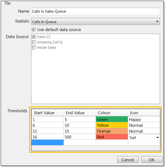 Thresholds
NOTE: The Icon threshold is only available for statistics presented on a tile. Once an icon threshold has been set, it will override the default icon.
NOTE: If the selected item displays time duration, then the value entered should be in time span format (HH:MM:SS). For example, a Supervisor wants Total Average Call Duration to display green if under 5 minutes, orange if longer than 5 minutes but less than 10 minutes, and red if longer than 10 minutes.
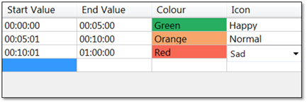
Time Span Thresholds
NOTE: Users can delete thresholds by right-clicking on the desired row and clicking Delete Row.
- Click OK to save the new graphical template.
For additional assistance, please contact a member of our Amazing Service team by emailing support@nextiva.com to immediately open a case.
Related Articles:
- Installing Nextiva Unity
- Manually Upgrading Nextiva Unity Desktop
- Nextiva Unity Agent Interface
- Nextiva Unity Reception Interface
- Nextiva Unity Supervisor Interface
- Managing Calls from Nextiva Unity
- Managing Call Recording from Nextiva Unity
- Transferring a Call from Nextiva Unity
- Escalating a Call to a Supervisor
- Sending Instant Messages from Nextiva Unity
- Silent Monitoring from Nextiva Unity Supervisor
- Customizing Statistics in Nextiva Unity Supervisor
- Configuring Thresholds from Nextiva Unity Supervisor
- Creating Tabular Templates in Nextiva Unity Graphical Dashboard