Add metric tiles to dashboards while creating a dashboard from scratch or from a system-generated template or while modifying a dashboard. Metric tiles also apply to wallboards.
- In the dashboard editor, click Add Elements, then select Metric Tile to open the Metric Tile Configuration window.
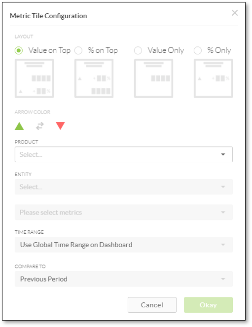
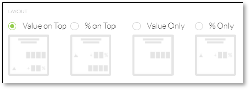
- Under Layout, specify the appearance of the metric.
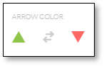
- Under Arrow Color, click the gray Double Arrow icon to set the colors for the up and down arrows.
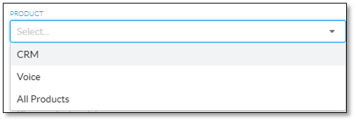
- From the Product drop-down list, select a NextOS product (e.g. CRM).
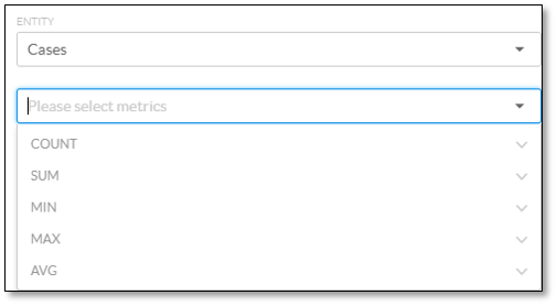
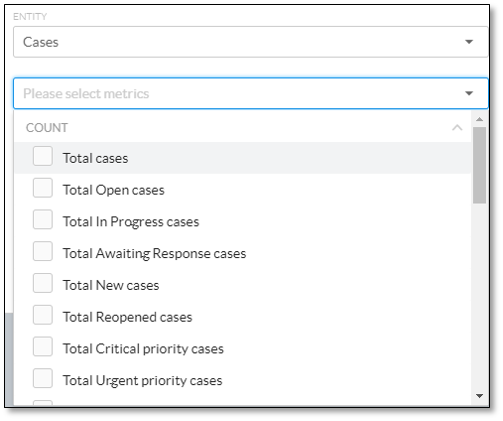
- From the Entity drop-down list, select an entity (e.g. Cases), then expand a metric group (e.g. COUNT).
- Select the checkbox corresponding to the desired metric. Select multiple metrics to add multiple metric tiles to the dashboard. The list of metrics is based on the NextOS product selected above. For information on the available metrics for Cases, click here. For information on the available metrics for Sales, click here.
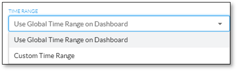
- From the Time Range drop-down list, select either Use Global Time Range on Dashboard or Custom Time Range.
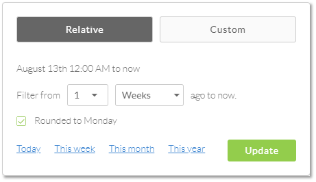
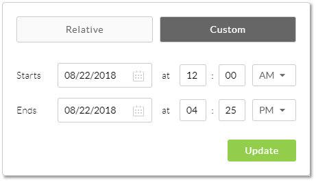
- For Custom Time Range, click either the Relative button to specify a relative time range or the Custom button to set a more specific time range, set the time range, and then click Update.
NOTE: The custom time range specified here will be applied to the data in the tile no matter what time range the user selects in the published dashboard.
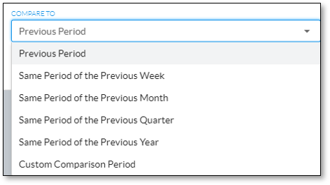
- From the Compare To drop-down list, select how to compare the metric (i.e. the % change to be calculated).
- Click Okay to add the metric tile(s) to the dashboard canvas.
- Change the appearance of the metric tile element on the dashboard as desired. For information on modifying the metric tile element on dashboards, click here.
Related Articles:
- What is Dashboard Builder in NextOS Analytics?
- Creating Standard Dashboards in NextOS Analytics
- Creating Wallboards in NextOS Analytics
- Adding Reports to Dashboards in NextOS Analytics
- Renaming Dashboards in NextOS Analytics
- Modifying the Report Element on Dashboards in NextOS Analytics
- Modifying the Metric Tile Element on Dashboards in NextOS Analytics
- Configuring Dashboard Settings in NextOS Analytics
- Duplicating Dashboards in NextOS Analytics
- Deleting Dashboards in NextOS Analytics
- Using Dashboard Templates in NextOS Analytics
- NextOS Analytics Metrics Glossary for CRM Cases
- NextOS Analytics Metrics Glossary for CRM Sales