Create custom reports to run once, or save them to run regularly.
- Visit nextiva.com, and click Client Login to log in to NextOS.
- From the NextOS Home Page, select Analytics.
- Select Reports in the left navigation panel.
- In the Reports view, click the Add New Report button at the top-right corner of the page. Configure the new report with the Create New Custom Report form.
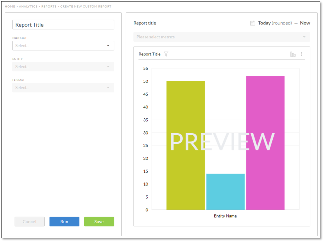
- Enter a name for the new report; otherwise, Report Title is the default name.
NOTE: If you are running a one-time report with no intention of saving it, it is unnecessary to title the report.
- Select the desired Product. This list will only include products for which a license has been purchased.
- Select the desired Entity. This list will only include entities that are relevant to the selected product (e.g. Voice will only include Calls, but CRM will include Cases, Interactions, and Sales).
- Select the Format for presenting the data.
- Aggregate: Totals, percentages, time series, and averages.
- Compare: Groups and comparisons of metrics over various dimensions.
- Entity Log: List of entities and their respective attributes to provide the raw data that is aggregated in other reports.
- Sales Log: List of sales transactions and related information.
- Breakdown: The period in which the data is presented. This can be spans of time, such as hours or days of the week.
- For the Compare format, define the following parameters:
- Dimension: A field or trait of the selected Entity by which you can group data (e.g. Users). The values present in this list will vary depending on the selected Entity.
- Dimension Value: The dimension’s values to compare. The values present in this list will vary depending on the selected dimension.
- All: Adds all values of the selected dimension to the report.
- Custom Selection: Adds to the report the selected values of the selected dimension. For example, if you select Users for the dimension, you can select specific users by name for the dimension value.
- Top 10: Displays the top 10 of, for example, topics of resolved cases, top 10 users associated with resolved cases, and so on.
- Watched: Displays the data values for the entities that are flagged to watch.
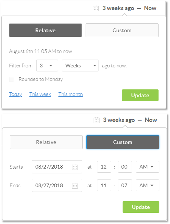
- At the top-right corner of the preview chart, select the time range.
- Click either the Relative button to specify a relative time range or the Custom button to set a more specific time range.
- Click Update.
- Once the table is customized, select the metrics to compare from the drop-down list above the Preview Chart.
NOTE: The preview chart uses mock data, and as such, the results are not indicative of the actual results after the report is run.
- Select the desired format to display the report by clicking the Chart Type icon at the top-right corner of the report preview box.
- For the Compare format, with only one metric selected, click the Sort icon at the top-right corner of the report preview box to sort the rows in the report, i.e. sort the order of the items shown in the chart or table.
- If you want to filter the data in the report to limit the results, click the Filter icon next to the report title above the chart. For more information on filtering report data, click here.
- To view the results of the report as a one-time report, click Run; otherwise, click Save to make the report available to run regularly.
Related Articles:
- What is Report Builder in Nextiva Platform Analytics?
- Viewing Reports in Nextiva Platform Analytics
- Editing Reports in Nextiva Platform Analytics
- Filtering Report Data in Nextiva Platform Analytics
- Duplicating Reports in Nextiva Platform Analytics
- Deleting Reports in Nextiva Platform Analytics
- Exporting Reports in Nextiva Platform Analytics